1 Point Perspective
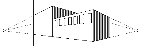
2 Point Perspective

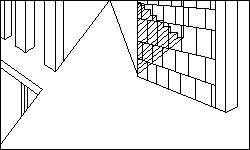
Amplified Perspective
Multi Point Perspective
|
|
CLASS NOTES:
CG130 Drawing & Design Fundamentals |
|
|
"Design Basics" Notes
|
|
OVERVIEW:
|
|
Below are the notes I took while reading through the "Design Basics" textbook assigned to this course. Frankly the tectbook seemed more like a glossary of terms with examples than anything functionally skills-based, which I had somewhat expected of an intro to drawing class. Raw notes without much interpretation: Content is what artists want to say, form is how they say it. Thinking, Looking, Doing Unity... some visual connection beyond mere chance having caused them to come together. Composition = Organization = Design Gestalt theory of visual psychology Proximity contributes to unity Continuity - The planned arrangement of various forms so that their edges are lined up. Unity With Variety Focal Point / Point of Emphasis When everything is emphasized... nothing is emphasized. Emphasis by contrast (direction, value, color, form, style, size...) A specific theme may, at times, call for a dominant, even visually
overwhelming focal point. Balance Symmetrical Balance Asymmetrical Balance Radial Balance Crystallographic Balance Balance by Value & Color Balance by Position and Eye Direction Rhythm Alternating Rhythm Progressive Rhythm "Kinesthetic" Implied Line Psychic Line Line as Value Linear Painting Shape / Form Design / Composition Naturalism Distortion Idealism Abstraction Rectilinear Curvilinear Texture refers to the surface quality of objects Pattern Size - Hieratic Scaling Arial/Atmospheric Perspective Linear Perspective |
|
|
|
|||
|
1 Point Perspective
|
2 Point Perspective
|
|||
|
|
|
|||
|
Amplified Perspective
|
Multi Point Perspective
|
|
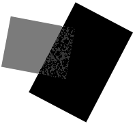
Transparency Equivocal Space
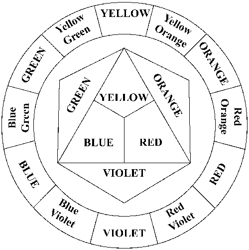
Value Value Pattern Chiaroscuro High value contrast seems to come forward. Shading Color (Additive System) Hue One hue can be varied to produce many colors. 12-Step Color Wheel (Subtractive System): Complementary Colors Value Intensity Simultaneous Contrast Cool Colors Warm Colors |
|