|
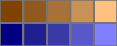
MONET - (Think Radiant)
|
|
DARKS
|
-
|
MIDS
|
-
|
LIGHTS
|
|
Pure Color
|
-
|
Clean Tints
|
-
|
White
|
|
-
|
Value
|
-
|
Value
|
-
|
Value
|
-
|
Value
|
-
|
Value
|
|
Sat.
|
100
|
Sat.
|
75
|
Sat.
|
50
|
Sat.
|
25
|
Sat.
|
0
|
|
Bright.
|
100
|
Bright.
|
100
|
Bright.
|
100
|
Bright.
|
100
|
Bright.
|
100
|
|
Note: View these effects against a WHITE Field.
|

|
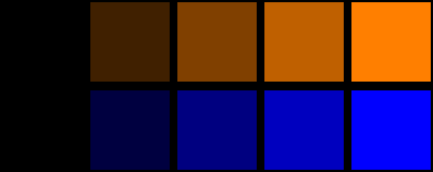
REMBRANDT - (Think Lustrous)
|
|
DARKS
|
-
|
MIDS
|
-
|
LIGHTS
|
|
Black
|
-
|
Rich Shades
|
-
|
Pure Color
|
|
-
|
Value
|
-
|
Value
|
-
|
Value
|
-
|
Value
|
-
|
Value
|
|
Sat.
|
100
|
Sat.
|
100
|
Sat.
|
100
|
Sat.
|
100
|
Sat.
|
100
|
|
Bright.
|
100
|
Bright.
|
75
|
Bright.
|
50
|
Bright.
|
25
|
Bright.
|
0
|
|
Note: View these effects against a BLACK Field.
|
|
EL GRECO- (Think Otherworldly)
|
|
DARKS
|
-
|
MIDS
|
-
|
LIGHTS
|
|
Rich Shades
|
-
|
Mellow Tones
|
-
|
White
|
|
-
|
Value
|
-
|
Value
|
-
|
Value
|
-
|
Value
|
-
|
Value
|
|
Sat.
|
100
|
Sat.
|
75
|
Sat.
|
50
|
Sat.
|
25
|
Sat.
|
0
|
|
Bright.
|
50
|
Bright.
|
56
|
Bright.
|
64
|
Bright.
|
76
|
Bright.
|
100
|
|
Note: View these effects against a WHITE Field.
|

|
TURNER - (Think Luminous)
|
|
DARKS
|
-
|
MIDS
|
-
|
LIGHTS
|
|
Dark Gray 75
|
-
|
Muted Tones
|
-
|
Clean Tint 75
|
|
-
|
Value
|
-
|
Value
|
-
|
Value
|
-
|
Value
|
-
|
Value
|
|
Sat.
|
0
|
Sat.
|
30
|
Sat.
|
50
|
Sat.
|
65
|
Sat.
|
75
|
|
Bright.
|
25
|
Bright.
|
40
|
Bright.
|
55
|
Bright.
|
75
|
Bright.
|
100
|
|
Note: View these effects against a BLACK Field.
|
|
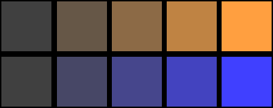
DAVINCI
(Uniform Chroma) |
|
DARKS
|
-
|
MIDS
|
-
|
LIGHTS
|
|
Rich Shades
|
-
|
Mellow Tones
|
-
|
Clean Tints
|
|
-
|
Value
|
-
|
Value
|
-
|
Value
|
-
|
Value
|
-
|
Value
|
|
Sat.
|
100
|
Sat.
|
78
|
Sat.
|
65
|
Sat.
|
56
|
Sat.
|
50
|
|
Bright.
|
50
|
Bright.
|
56
|
Bright.
|
65
|
Bright.
|
78
|
Bright.
|
100
|
|
Note: View these effects against a GRAY Field.
|